
Case study: TATTVA from essence to experience
Introducing a new concept on a different culture
Branding strategy for a fine-dining restaurant
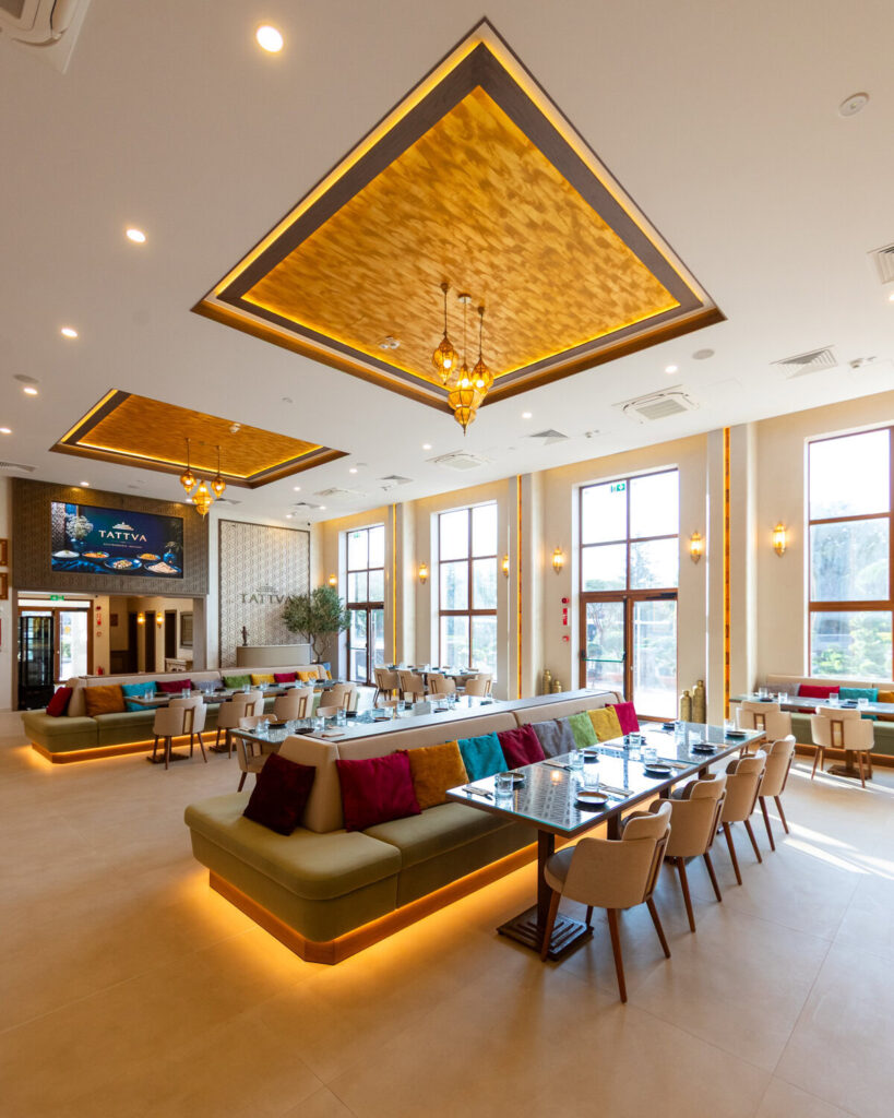
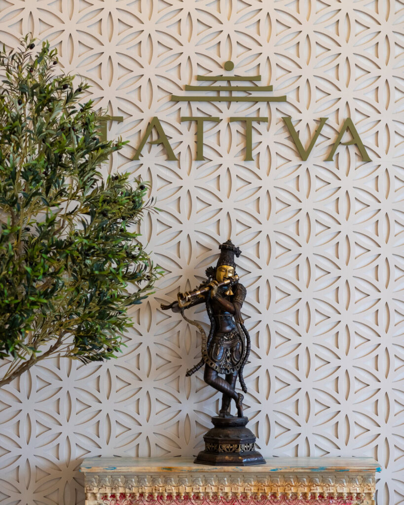

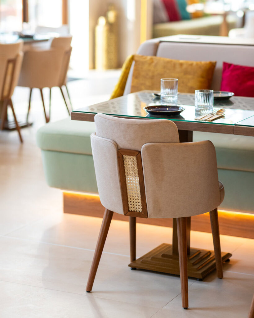


Understanding what was already there. The strongest starting points rarely need to be invented. They need to be understood.
Finding the right position. Indian fine dining, without the usual shortcuts.
Before designing the identity, we needed to understand the space TATTVA wanted to occupy.
Indian cuisine comes with an incredibly rich cultural and visual vocabulary. It also comes with a large number of defined conventions. Colour, ornament, typography, imagery and language can very quickly push a restaurant brand towards something familiar and expected.
For TATTVA, that would have limited the concept.
The restaurant was conceived as a fine-dining experience, so the brand needed to communicate a different level of intention. It had to feel considered, contemporary and culturally grounded while still being warm enough for hospitality. Premium could not simply mean minimal. Indian could not simply mean decorative. That tension became one of the most important parts of the strategy.
We positioned TATTVA around a more considered interpretation of Indian dining: one where heritage provides depth, contemporary execution gives it relevance and every element of the experience feels connected to the same central idea.
This positioning gave us a filter for the decisions that followed. If something felt generic, overly ornamental, culturally superficial or unnecessarily formal, it did not belong in the system.
The result was a clearer territory for the brand: sophisticated without becoming cold, expressive without becoming visually noisy and rooted in culture without becoming predictable.
Familiar roots. A different expression.
The Approach - Turning strategy into a brand system
Good branding needs more than a good-looking logo.
Once the positioning was clear, the next step was turning the strategic thinking into something practical.
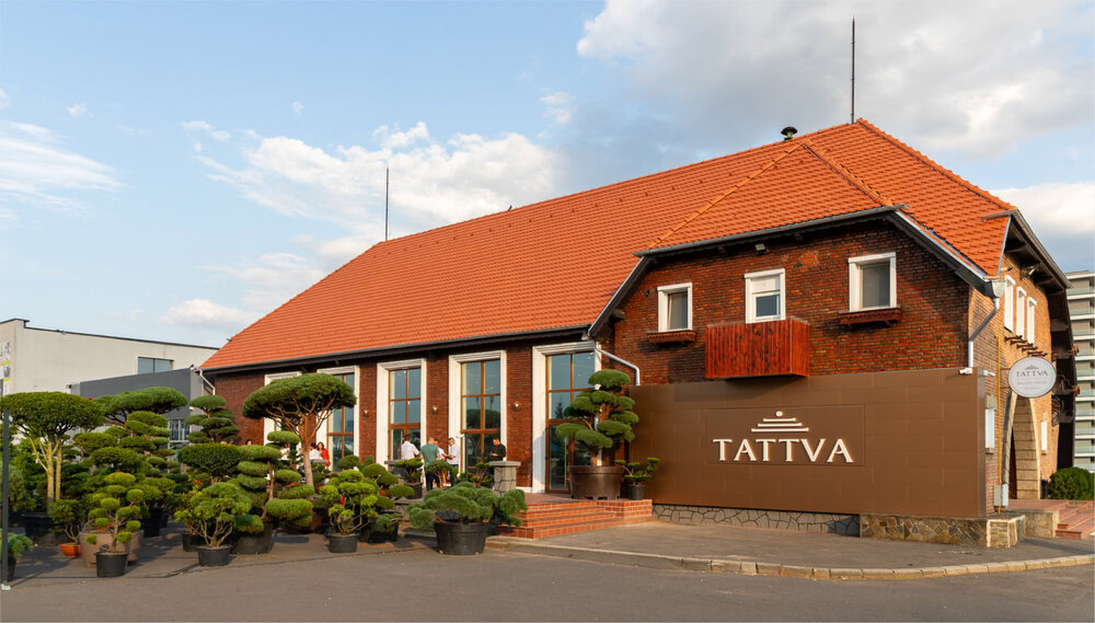
A restaurant brand has to live in many places at once. It appears on a building, bilboards, a menu, a reservation page, a social post, a photograph, a printed detail, a mobile screen and eventually in the memory someone takes home after dinner.
That means the identity cannot depend on one visual asset doing all the work.
We approached TATTVA as a system. The strategic foundation informed the visual identity, the visual identity informed the digital language and the same principles were carried through typography, colour, composition, imagery and communication.
The objective was consistency without rigidity. Every application needed to feel recognisably TATTVA while leaving enough flexibility for the brand to work across different formats, campaigns, menus and future communication.
This is where strategy became useful in a very practical way. Instead of making individual creative decisions based only on what looked good in isolation, we had a shared framework for deciding what felt right for the brand.

Building the visual identity
The visual identity needed to give form to everything designed during the strategy phase.
Rather than treating identity design as a collection of separate assets, we looked at the relationships between them.
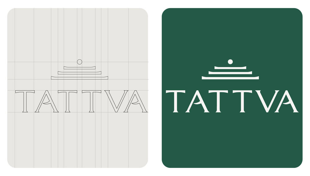
The identity was therefore developed around a set of visual behaviours rather than a single fixed look. How elements are combined, how much space they receive, how typography creates hierarchy and how imagery interacts with graphic elements all contribute to the same overall recognition.
How elements are combined, how much space they receive, how typography creates hierarchy and how imagery interacts with graphic elements all contribute to the same overall recognition.
That creates something more useful than consistency for consistency’s sake. It gives TATTVA a visual language that can evolve while remaining connected to the brand.
Creating a voice for the brand
The tone of voice was shaped around clarity and confidence. The brand does not need exaggerated luxury language to communicate quality. It can speak about food, ingredients, culture and experience with enough context to create interest while leaving room for discovery.
By developing the verbal identity alongside the visual system, the brand begins to feel coherent beyond design. The same thinking can move from a headline to a menu, from a digital interaction to a campaign and still sound like it comes from the same place.

Taking TATTVA digital From brand system to digital experience.
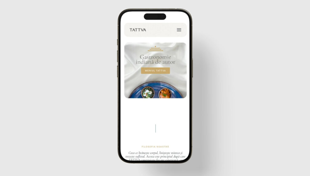
Once the strategic and visual foundations were confirmed, Perrfect Site translated them into the restaurant’s digital presence through the design and development of tattva.ro.
This stage was about more than applying colours, typography and imagery to a website layout. The digital experience needed to behave like TATTVA.
We looked at hierarchy, pacing, content structure and interaction as part of the brand experience. The site needed enough visual impact to introduce the restaurant properly while keeping the path to useful information simple. Concept, menu, location and reservation-related information needed to work together rather than compete for attention.
The visual system was adapted specifically for screen, with layouts built around the way people actually browse restaurant websites. Larger storytelling moments create atmosphere, while practical content remains easy to reach and understand.
The website also gave the identity something static brand applications cannot: movement and sequence. Instead of seeing the entire brand at once, visitors experience it gradually as they move through the page.
That allowed us to use digital design as another layer of storytelling.
The result
TATTVA started with a name and an ambition.
The finished project gives those things a complete framework: a strategic position, a visual identity, a verbal personality and a digital experience built to work together.
What makes the project interesting to us is not one individual asset. It is the relationship between all of them.
The meaning behind the name informs the strategy. The strategy shapes the identity. The identity creates the language of the brand. The same language moves into the website and becomes part of the way people discover and experience the restaurant.
That is the kind of branding we believe in: less about creating isolated pieces and more about building a system where every piece knows what it belongs to.
For TATTVA, that meant taking an idea that already had depth and giving it the structure, expression and digital environment it needed to become a brand.
TATTVA had the name. Together, we gave it a language, a system and a world of its own.